Many residents had faced small apartment decor mistakes that made their rooms feel tighter than they were. The living room was often the first place where poor choices squeezed circulation and dimmed the feeling of openness. Professional designers noted that layout, lighting, and oversized furniture were frequent culprits.
When decorating, they learned that balance mattered. Good design used light and scale to expand the eye. Thoughtful selection of furniture and a clear flow helped each space feel more functional and calm.
By spotting these recurring mistakes, anyone could turn a cramped unit into a cozy, stylish home. The guide ahead will highlight practical fixes for the living room and other spaces so readers could make the most of every room.
Understanding the Impact of Small Apartment Decor Mistakes
Many people copied design rules meant for large houses and found that those choices did not translate well to tighter spaces. This mismatch often left a living room or studio feeling more crowded than before.
After the renovation budget was spent, buyers often realized the furniture scale and layout had reduced usable space. Paint was dry and returns were rare, but the problem remained: the room still felt cramped.
Experts noted that the root cause was usually a failure to respect the constraints of a smaller home. When people ignored circulation paths and multifunctional needs, they wasted square footage and reduced daily comfort.
- Applying large-house principles to compact spaces can create clutter and block movement.
- Good planning makes every piece work harder so that each area stays functional.
- Spotting common errors early saves time and money while improving interior design outcomes.
The Pitfalls of Oversized Furniture
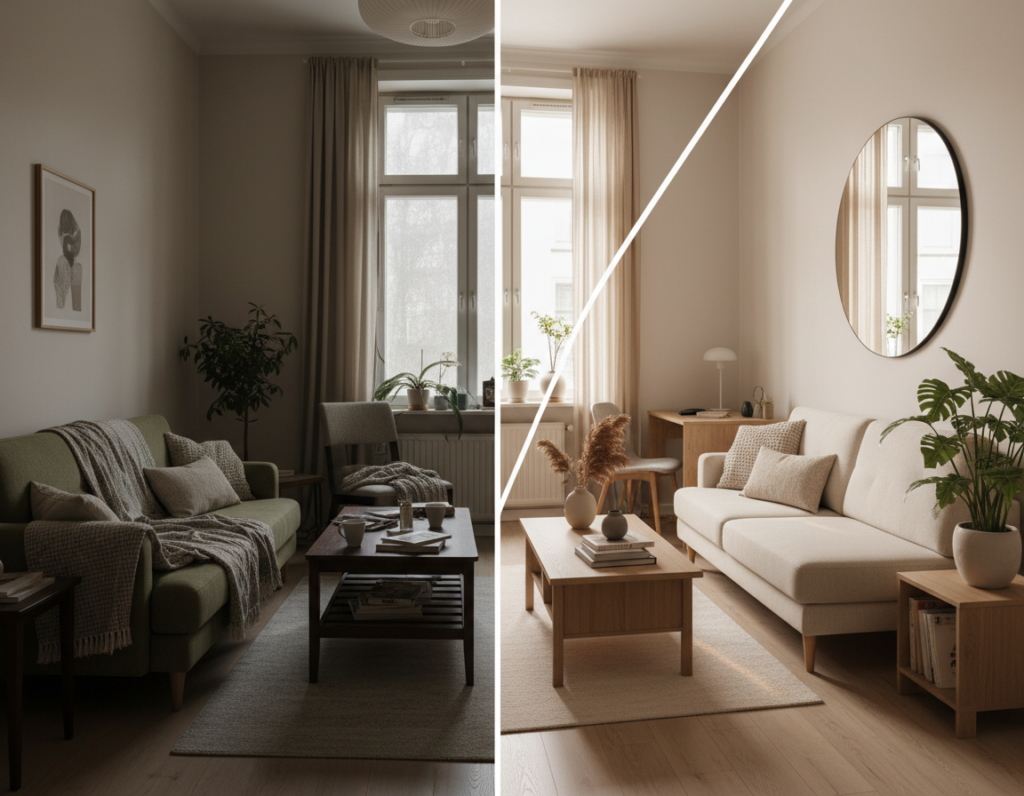
Oversized seating often steals visual floor and leaves a room feeling boxed in. Many people thought a deep sectional would be cozy, but it can dominate the view and break the intended flow.
Designers advise measuring the area and noting ceiling height before buying any major piece. Allison Garrison of Allito Spaces stresses that a sofa should fit the living room comfortably to keep scale balanced.
Selecting Proportional Pieces
Meghan Jay of Meghan Jay Interiors warned that a too-large sofa can “look like a literal elephant in a small room.” Choosing items with exposed legs or slimmer profiles helps preserve sightlines and an open space.
Utilizing Multifunctional Furniture
Barrett Cooke recommends dual-purpose pieces. A coffee table with storage frees floor area and reduces excess furniture that only serves one purpose.
- Measure before you buy to avoid buying a piece that overwhelms the place.
- Prefer tailored items that match ceiling scale and overall style.
- Use multipurpose tables to keep the floor clear and improve circulation.
“Choosing the right scale makes the whole interior feel intentional.”
Why Relying on Single Light Sources Fails
A single ceiling fixture can leave strong shadows that shrink visual depth in a room. This common lighting issue makes an area feel closed off and flat.
Layering light solves this by adding depth and flexibility. Amanda Leigh of House of Rolison recommends mixing overhead, floor, and table lamps to create balanced ambient and task lighting. Sarah Tract Interiors places slim lamps in the corners of the living room to lift dark zones without crowding floor space.
Layering Ambient and Task Lighting
Why it works: layered lighting removes harsh shadows and highlights architectural features. The Illuminating Engineering Society found that a mix of sources makes a home feel larger and more comfortable.
- Relying on one overhead light creates uneven shadows and reduces perceived space.
- Place slim lamps on side tables or in corners to distribute light evenly.
- Combine ambient and task fixtures to brighten work areas and seating zones.
- Avoid the mistake of one-source lighting to make the room feel inviting.
“Layered lighting changes how you experience a room; it adds depth and warmth.”
Neglecting Vertical Storage Opportunities
Using the height of a room can free the floor and change how the space reads. Turning upper walls into storage keeps pathways open and makes the interior feel larger.
Gideon Mendelson of Mendelson Group recommends wall-mounted consoles and shelves to keep furniture off the floor. These choices make the home look lighter and improve circulation.
One Los Angeles studio — 420 square feet — increased its storage capacity by nearly 60% after installing full-height shelves. That change boosted function without shrinking the room.
Meghan Jay suggests hanging draperies right under crown molding. This visual trick draws the eye up and creates a taller, airier impression.
- Neglecting vertical storage leaves the top half of your walls unused.
- Wall-mounted shelves clear the floor and support smarter decorating and design choices.
- Full-height units let you store more without crowding the living room.
“Raising storage makes every square foot work harder.”
The Danger of Overcrowding with Decorative Accessories
A few ill-chosen accessories will crowd sightlines and break a room’s flow. Too many items on shelves, tables, and consoles create visual clutter that makes circulation feel tight.
Designers advise that restraint wins. Gideon Mendelson of Mendelson Group recommends selecting a handful of purposeful pieces rather than filling every surface with trinkets.
Silo Studios suggests adding one over-scaled artwork or statement piece to introduce interest without stealing floor space. A single bold piece can anchor the interior and reduce the urge to layer many smaller items.
- Overcrowding a room with too many decorative accessories turns the interior chaotic and cluttered.
- Choose a few purposeful pieces; quality often reads better than quantity.
- When styling a coffee table, keep surfaces mostly clear so the furniture reads intentional.
- One bold artwork can energize a room without adding visual noise.
- Maintain a minimalist approach to keep the space functional and calm.
“Less is more—curation makes each piece matter and the whole design breathe.”
Poor Layout Planning and Obstructed Pathways
When furniture fights the natural way people move, the whole interior seems smaller. That conflict limits use of the room and makes daily routines awkward.
Clear circulation starts with measurement. The American Institute of Architects endorses 30 to 36 inches of clearance for pathways to keep the flow of a home unobstructed.
Maintaining Clear Walkways
Designers like Amanda Leigh recommend floating furniture slightly off the walls to create breathing room. Kristen Keyes shows that a gap behind a sofa opens sightlines and improves movement.
Defining Functional Zones
Use rugs or open shelves to mark separate areas without building barriers. These elements help define living, dining, and work zones while keeping the floor open.
- Avoid pushing every piece against the wall; it can block natural pathways.
- Keep at least 30–36 inches of clearance for easy navigation.
- Use rugs and shelves as simple tips to shape the area and support flow.
“Thoughtful layout turns circulation into a silent advantage.”
Choosing Ineffective Color Schemes
Colors define depth; poor choices remove it and leave a room feeling boxed in.
Choosing ineffective color schemes is a common issue that can make an apartment feel flat or even smaller. Gideon Mendelson of Mendelson Group notes that both dark and light paint can work when balanced with the right furniture and accents.
Layering neutral tones adds visual depth and helps interior design feel intentional. Research in color psychology shows that varied neutrals create the illusion of space while keeping the palette cohesive.
- Too little contrast makes the whole area appear one dimensional; add textured rugs or bold accents to break that sameness.
- A lack of contrast and poor placement of light reduces perceived volume—use trims, textiles, and lighting to add depth.
- Dark hues work when paired with reflective surfaces and lighter textiles; balance is the key to a successful design.
“Both dark and light paint can succeed when paired with thoughtful furnishings and layers of texture.”
Ignoring the Potential of Entryways
The entryway sets the tone for the rest of a home and often delivers the first impression guests remember. Ignoring this strip of space made many units feel chaotic from the moment someone walked in.
A purposeful entry provides essential storage and keeps the main living area clear of daily items. Even in a very small apartment, a slim shoe cabinet, a narrow console, or a row of wall hooks reclaimed floor area and reduced clutter.
Designers recommended a dedicated spot for keys, bags, and mail. That simple habit improved flow and cut down on hurried searches during departures and returns.
- Maximize vertical storage: hooks and floating shelves free up furniture on the floor.
- Choose narrow pieces: slim cabinets preserve circulation while adding function.
- Make it welcoming: a mirror and a single artwork signal intentional design.
“The entry is the first impression of the whole apartment; make it both useful and inviting.”
Overlooking Ceiling and Flooring Design
Ceilings and floors often work in silence, yet they can transform how a room is perceived. Many homes felt unfinished because designers focused only on walls and furniture.
Light-colored flooring helps open the plan visually. A pale oak or warm maple surface reflects overhead light and creates a sense of breadth. Lighter floors also pair well with rugs to define zones without heavy contrast.
Simple crown moldings or modest ceiling trim add texture and finish. Subtle patterns or beadboard on ceilings draw the eye upward and introduce a vertical emphasis that increases perceived height.
Consider lighting as an integrated choice with finishes. Proper placement of overhead fixtures, recessed cans, and wall washers ties the floor and ceilings into one cohesive interior design strategy.
- Choose light floors to reflect light and expand the view.
- Add simple moldings to create finish and depth.
- Use overhead fixtures that complement floor tones for cohesion.
- Try a faint ceiling pattern to lift the eye and enhance the interior.
“A considered ceiling and floor can make the whole home feel intentional and larger.”
Strategies for Creating Visual Flow
Guiding the eye from one area to the next creates the illusion of a larger, connected home. Visual flow is a practical way to make an interior feel cohesive and easy to move through. Design choices that respect sightlines help each area read as intentional.
Using Mirrors to Expand Space
Designers often place mirrors to reflect natural light and broaden a living room visually. Gideon Mendelson of Mendelson Group recommends a tall mirror opposite a window to duplicate daylight and open the view. Amanda Leigh of House of Rolison notes that mirror placement can lift darker corners without adding bulk.
Place furniture so it does not block the reflected sightline. A well-placed sofa or a slim console can guide movement and keep the eye traveling across the area. Choose pieces with low profiles and clear pathways to preserve flow.
- Keep pathways clear: maintain at least one uninterrupted route through the room.
- Use reflective surfaces: mirrors and glossy accents boost perceived depth.
- Anchor one statement piece: let a mirror or artwork set the focal way the eye moves.
For tips on common pitfalls and practical fixes, see this short guide on living room decor pitfalls. Implementing these strategies helps every item contribute to a stylish, functional flow.
Conclusion
In short, a clear plan makes any room feel larger and more usable. They should focus on layout and lighting first to fix the biggest problems and avoid recurring mistakes.
Careful choices help people create a comfortable home without a full overhaul. Practical tips — measured furniture, layered lighting, and honest circulation checks — let an apartment work harder and look intentional.
Simple edits to color, mirrors, and storage transform the feel of a place. When they plan thoughtfully or consult a pro, each piece earns its spot and the whole interior breathes easier.